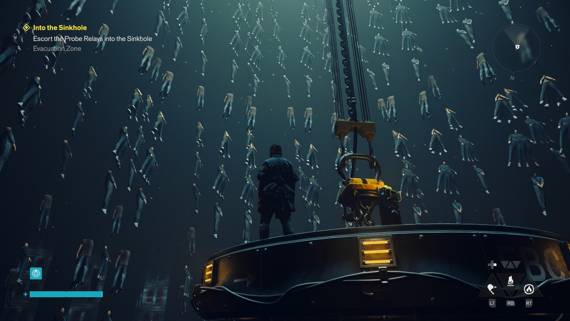
Just days after Microsoft’s official unveiling of its next-generation gaming initiative, Project Helix, the gaming community has erupted with speculation and creativity. While official details remain scarce, a detailed fan-made concept for the console’s user interface has captured widespread attention, offering a tangible glimpse into what the future of Xbox might look like. Created by the well-known enthusiast and digital designer Klobrille, the concept draws direct inspiration from the iconic Xbox 360 dashboard, reimagining its signature “blades” aesthetic for a modern hardware generation.
The Vision Behind the Viral Concept
Klobrille, a respected figure within the Xbox community known for accurate insights and high-quality conceptual work, shared the design across social media platforms. The concept is not presented as a leak or insider information but as a thoughtful proposal based on publicly available rumors and a clear design philosophy. The core idea is a return to a more functional, snappy, and visually distinct interface that many associate with the peak usability of the Xbox 360 era. This stands in contrast to the more homogenized, app-based layouts that have dominated recent console dashboards.
Design Philosophy: Nostalgia Meets Modern Function
The proposed interface is built around a horizontal navigation system using sharp, angular “blades” or tabs. Each tab represents a core console function: Games, Media, Friends & Community, Store, and Settings. The design utilizes a dark theme with vibrant accent colors that shift depending on the selected tab, creating a dynamic and immersive visual experience. Animations are envisioned as quick and precise, eliminating perceived lag or bloat from the current user experience. The concept heavily emphasizes speed of access, proposing that any core function or recently played game should be no more than two button presses away from the Home screen.
Key Interface Features Proposed
Several specific features highlighted in the concept have generated particular discussion. A unified Game Library presents all owned titles, Xbox Game Pass offerings, and streaming options in a single, filterable view. The Community blade integrates real-time activity from friends, club updates, and curated content feeds seamlessly. Furthermore, the concept introduces a “Helix Core” widget, presumably tied to the console’s rumored hybrid cloud/local processing architecture, showing system status and optimized game modes. The attention to detail extends to mock-ups of the Quick Settings menu and a redesigned guide, suggesting a comprehensive overhaul rather than a superficial skin.
Community Reaction and Industry Implications
The response from gamers and industry observers has been overwhelmingly positive. On forums and social media, the sentiment frequently echoes a desire for Microsoft to take note. Many users have expressed that the concept addresses long-standing complaints about dashboard clutter, advertising placement, and slow navigation. The viral spread of this fan work demonstrates a clear market appetite for a UI that prioritizes user experience and gaming-first functionality over broader media consumption metrics. It acts as a powerful piece of unsolicited user feedback, visually articulating the preferences of a dedicated segment of the console’s user base.

The Challenge for Microsoft’s Official Design Team
While fan concepts are rarely adopted wholesale, they can influence design thinking by validating certain directions. Microsoft’s official UI team for Project Helix now operates in a space where a highly specific, community-approved vision already exists. The challenge will be balancing modern platform requirements—such as deep integration with subscription services, cloud gaming, and non-gaming entertainment apps—with the streamlined, gamer-centric ethos this concept embodies. Furthermore, the concept sets a high bar for visual polish and nostalgic appeal that, if unmet, could lead to comparisons unfavorable to the final product.
The Role of Nostalgia in Next-Gen Marketing
Klobrille’s decision to anchor the concept in Xbox 360 design language is strategically astute. The Xbox 360 era is remembered fondly for both its software library and its social, community-driven dashboard. By evoking this period, the concept taps into powerful nostalgia, suggesting that Project Helix could represent a return to form or a reclamation of Xbox’s core identity. This aligns with broader industry trends where retro aesthetics and callbacks are used to build hype and connect with longtime fans. It positions the new interface not just as a tool, but as an emotional bridge between generations of hardware.
Technical Feasibility and Performance Goals
Beyond aesthetics, the concept implies significant technical ambitions. The emphasis on instantaneous response and minimal load times suggests an expectation that Project Helix’s hardware will dedicate resources to maintaining a fluid shell, even during intensive gameplay. This requires robust memory management and a lightweight operating system kernel. The concept’s clean visuals also hint at a desire for system-level efficiency, ensuring maximum resources are available for games themselves, a constant point of discussion among performance-focused gamers.
Comparison with Current and Competing Interfaces
When placed side-by-side with the current Xbox Series X|S dashboard or the PlayStation 5’s UI, the Helix concept stands apart through its pronounced identity. Where current designs often feel like iterations of smart TV menus, the blade-based concept is unmistakably “gaming.” It forgoes the large, static promotional tiles in favor of a denser, more information-rich layout controlled by the user. This comparison has fueled debates about whether console interfaces should be minimalist media hubs or powerful gaming dashboards, with the Helix concept firmly championing the latter.
What This Means for the Future of Project Helix
The viral success of this fan concept has undoubtedly raised the stakes for Microsoft’s official reveal of the Project Helix interface. It has created a measurable benchmark for community satisfaction. While Microsoft will have its own data-driven design priorities and partnerships to consider, ignoring the loud and clear message embedded in this reception would be risky. The concept proves there is a strong audience for a UI that feels fast, dedicated, and respectful of the player’s time. It shifts the conversation from abstract speculation about teraflops and features to a concrete discussion about daily user experience.
As the industry awaits more concrete details, this episode underscores the evolving relationship between platform holders and their communities. A compelling fan vision can shape expectations and frame the narrative around an unreleased product. Whether Microsoft’s final design incorporates the blade aesthetic or not, the core principles of speed, clarity, and gaming-centric design championed by Klobrille’s concept will likely be a lens through which the official Project Helix dashboard is judged. The ultimate success of the interface may depend less on matching a specific visual and more on delivering on the fundamental promise of a seamless return to what players love most: instantly diving into their games.




/i.s3.glbimg.com/v1/AUTH_08fbf48bc0524877943fe86e43087e7a/internal_photos/bs/2026/q/p/xkrnfASUWa5SSkay0x6A/marvels-wolverine-20260907193401.jpg "Marvel’s Wolverine Best Techniques to Unlock First")